Skip to page content or skip to Accesskey List.
Search evolt.org
evolt.org login: or register

Work

Main Page Content

How Visual Design Can Impact your Bottom Line

Rated 4.14 (Ratings: 5) (Add your rating)

Log in to add a comment
(10 comments so far)

Want more?

 
Picture of Brad Henry

Brad Henry

Member info | Full bio

User since: October 11, 2006

Last login: May 24, 2007

Articles written: 1

A point of discussion among many clients is Should I invest more money into getting an updated design for my website? This question is typically hard to answer because it is not always easy to see the impact from the investment on your bottom line. I recently had the opportunity to work with a national flower delivery site and was given the chance to try some new design concepts out. The site had remained consistent in its look and feel over the past couple of years with no major updates so I had a steady stream of analytics and conversion data for the before comparison.

The Old Design

Old Design Screenshot
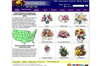
The old design had a nice clean feel to it with not a lot of color in order to focus the eyes and interest towards the products being offered versus the design of the site. When it was created, simplicity was a central focus and that was apparent in the finished product. The site had a white background with a dark header and minimal light grays surrounding the product categories.

The Research

This type of minimalist design was the norm for most ecommerce related website 2-3 years ago and we are still seeing that trend carry over to even new designs being released today. However, people will associate trust with the overall look and feel of the website and if the site does not convey the message that it is associated with its target market it can lower a person's trust in the site thus decreasing the overall conversion rate. I recently read the website credibility study by the Persuasive Technology Lab at Stanford University which highlights that specific point by saying that 46.1% of people associate the design look of the site when evaluating a site's credibility. This means by going with a super minimalist design you forego great branding opportunity and your site's chance to create a great credible first impression. While creating a clean, non distracting website is still very important, creating a site that utilizes design to create a consistent and accurate portrayal to your target market is just as important.

The New Design

New Design Screenshot
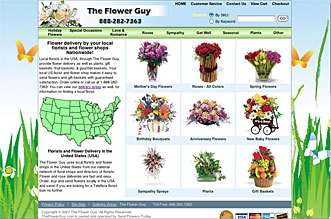
When I began creating ideas for refreshing the design of the site, I took into consideration that the client was in the flower business and his website needed to convey that message. The easiest way to accomplish this was to integrate a floral pattern or design into the background. I am not a vector design artist but I like the custom look that a vector graphic can deliver and they can produce bright, vivid images so I was able to search through stock photo sellers and find a nice vector image that I could customize to fit my needs. It was important to pick a design that would not be overbearing so that a user could still focus on the products but would still create a since of attachment and belonging to the floral industry. After finding a great graphic, I was able to modify it in Photoshop to lighten the background and to move some of the internal components of the graphic to make room for the ecommerce container.

Now that I had the perfect graphic, I was able to adjust the website's color palette to be consistent with the background's palette. This created a nice integration of the ecommerce storefront into the background and by keeping a white background for the container; the eyes are still able to easily focus on the individual products. The overall project did not take that much time and was ready to push to production at the beginning of May 2007.

The Results

After the new design was pushed to production we began to notice an increase in the conversion rate almost immediately. Below is a graph that charts the conversion rate over 2007. The new design was just pushed to production on May 1, 2007.

Goal Conversion Chart, Jan 31 2007 to May 17 2007
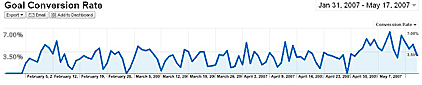
Total Goal Conversion Rate: 3.28%

We can see from the graph that we had an increase in the conversion rate beginning at the beginning of May that has continued to date. The increase could possibly be contributed to the Mother's day holiday but if we compare to the conversion rate during the busiest season which is Valentine's day it clearly is producing a higher conversion rate. We can also observe that the conversion rate increase spans past Mothers day into regular days.

Goal Conversion Chart, April 1 2007 to April 30 2007
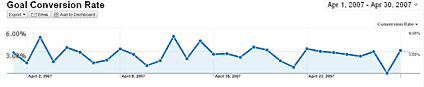
Total Goal Conversion Rate: 2.73%

If we look at just April 2007, the month before the update, we can see a 2.73% conversion rate. If we compare that to after the design update below we can see that we have a 4.56% conversion rate indicating that this design update has almost doubled the conversion rate and that, you will feel on your bottom line.

Goal Conversion Chart, May 1 2007 to May 17 2007
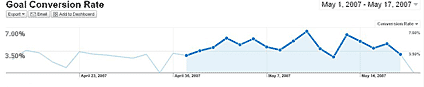
Total Goal Conversion Rate: 4.56%

Conclusion

In this case study we have been able to observe a clear indication that creating a fresh design that is consistent with your target market's industry perception can have a very positive impact on your site's capability to produce revenue. Even increasing your site's conversion rate by 1% can mean hundreds of thousands of dollars in revenue so the next time budgeting comes up for your next website design, take this into consideration because ensuring your site's visitors can make a clear connection between the look and feel of your site and what your site is supposed to represent is an important step to providing your potential customers with the confidence to go ahead place their orders.

AttachmentSize
flowerguy_scr1.jpg27.22 KB
flowerguy_scr2.jpg33.51 KB
flowerguy_chart1.png9.29 KB
flowerguy_chart2.png7.01 KB
flowerguy_chart3.png6.44 KB
I currently work as an SEO Engineer for Beacon Technologies. Beacon provides a wide range of technology services including website development, ecommerce solutions, search engine optimization, and custom software development. At Beacon, we aim to provide the best solutions for the client's individual needs and work with major industry leaders including Lockheed Martin, Bassett Furniture, New Jersey Resources, SpaceSavers and many others. Please feel free to contact me with any questions.

A note of caution on conversion rates

Submitted by MartinB on May 18, 2007 - 09:29.

While percentage improvements in conversion rates are Good Things, you've not shown whether they're real or not. Without knowing the <em>number</em> of conversions, it's impossible to know whether the rise is beyond the <a href="http://www.robertniles.com/stats/margin.shtml" rel="nofollow">Margin of Error</a> &mdash; a statistical tie.

Once you're into this kind of evaluation (which is essentially Direct Marketing Analytics), you <em>need</em> to know those stats principles. And to turn yourself into an honourary <a href="http://www.sos.mo.gov/archives/history/slogan.asp" rel="nofollow">Missourian</a> and/or <a href="http://www.knowyourtype.com/sensing.html" rel="nofollow">MBTI Sensing preference</a>.

login or register to post comments

Not quite User Friendly Though

Submitted by nainil on May 21, 2007 - 02:51.

I just visited your so called website: http://www.theflowerguy.com/

It surely seems to bring a good impact visually. However for those who are color blind it is not quite user friendly. The colors at the bottom of the page blend with the links making it very difficult for a person to read.

However on this particular instance your particular research / case study is quite relevent and thus informatic.

Nainil Chheda

login or register to post comments

I've done similair experiments

Submitted by Tjeerd Kramer on May 22, 2007 - 05:51.

Your example shows, once again, that design should not be overlooked, so thanks for sharing! I've run similair tests, and it's amazing what color scheme's can do to your conversion! Changing from a red theme into a blue one (otherwise very similair) conversion went from 2.2% up to 2.8%! A yellow variant showed a smaller increase, 2.4%. - Try before you die!

login or register to post comments

Nice site & article

Submitted by akany on May 22, 2007 - 17:13.

But I doubt that a 30 day timespan is very meaningful.

login or register to post comments

Response from the Author

Submitted by Brad Henry on May 24, 2007 - 21:12.

I agree that more than 30 days would be more meaningful and I will update this article at the end of July 2007 with more data as it is collected but wanted to go ahead and show that I am already seeing a real difference in conversion rates. Whether you believe the numbers are real or not, my article was not out here to trick anyone but to show that design does impact how people view your site’s credibility. Take what you want from the article and choose to ignore it if you want as well.

Nainil; when designing it I must admit, taking the color blind into consideration slipped through the cracks. There are multiple types of color blind people so it would be more helpful if you narrowed down the type you are referring to so I can make more informed adjustment that may make the usability a little easier.

Thanks,
Brad Henry
SEOslap

login or register to post comments

Ongoing refinements?

Submitted by Marcel Feenstra on May 27, 2007 - 20:50.

If I understand your article correctly, you changed the site's design, then observed an improvement in your conversion rates. (BTW, I find the graphs very hard to read...) While this is obviously a nice result, I was wondering if you wouldn't be able to achieve better results still by changing one element at a time and running an A/B split test to see which version performs better, rather than changing everything at one fell swoop. In Direct Marketing, it is very common to use this approach --you may have a Good Thing already, but you keep trying to make it better all the time though "ongoing improvements"; and it is not at all unusual to double or triple conversion rates through a whole series of relatively "minor" adjustments!

login or register to post comments

clutching at straws

Submitted by germ on May 28, 2007 - 05:02.

Yes I agree that a "better design" does help keep users coming back but I think you are clutching a bit at straws by saying that the increase is by the "better design" alone.

login or register to post comments

Visual Design is so subjective

Submitted by El Kabong on June 19, 2007 - 19:36.

Here are some of my feedback on this article. Some of it may sound harsh, but take it as constructive feedback from a veteran... hopefully the audience can have some take-aways, as well as give the author some food for thought.

- Design is subjective. Just because the designer feels the end result "looks good", it does not necessarily reflect the end user's view.

- The "research" conducted by the author of this page can not be considered as one. Reading published articles, which do not relate to your end-users are just reading materials. True research is done by understanding your end-users: their needs, goals, frustrations & most importantly the purpose behind why they would use such service. There are so many ways of skinning this cat (Personas, Ethnographic research, Focus groups, etc. etc.), but the least appropriate of them all is reading a bunch of articles and extracting what seems to be a convenient conclusion.

- "Conversion Rate", within a consumer G&S is very tricky... was there any marketing effort associated with new design? Were there any promotions? High season? It would be good to see a comparison to last year this time, and see the uplift. A flower shop (online of offline), is a roller coaster of a business. Your sales equal the number of occasions that occur around your shop. Your online sales equals the number of occasions that occur within your immediate geographical location. A 3-something percent uplift should only be attributed to the "design", if it is a sustainable gain over 90-plus days.

<h3>Now here are my personal comments:</h3>

- The new design does not communicate "brand" to the user. In fact, I think the old design emphasized the Logo (the most memorable brand element)a lot more elegantly than the new one.

- The design does not scale elegantly: If you stretch the browser wide enough, the main navigation links fade into the background. There needs to be some re-thinking of how to implement your design, because on my 1600x1200 screen resolution, I can only see 3 link on the top nav.

- The plethora of "United States Florists & Flower Shops" links at the bottom of the page scream "cross-linking dead sites" to the user. I think you should look at sites like http://www.facebok.com (yes, the mis-spellt version), and do your best not to follow their direction. Furthermore, the links at the bottom are near impossible to read, as they compete with the busy background.

- I strongly recommend testing your design against various colour-blindness, to make sure the heavy usage of blue/blue and green/blue does not render the design mute for those misfortunate consumers.

- And since this article is posted in the IA/Usability section, here are some major usability flaws. There are quite a few others, but the list below should help you put the usability of the site on the right path.

1. Lack of ALT tags
<p>
2. Lack of link labels
<p>
3. Redundant Top and Left Nav items, with 2 completely disconnected ways of rendering them
<p>
4. No Sorting
<p>
5. No short descriptions associated with the list of flowers... just a picture and price
<p>
6. The flower details has no "default" value for the quantity
<p>
7. Breadcrumb does not link to the associated page

Cheers,
El K!

login or register to post comments

Great Article

Submitted by David Eaves on August 5, 2007 - 00:02.

I think the new design is much better and I am not surprised you have seen an increase in conversions, I am thinking about getting my site re-designed to make it look more professional I have a feeling that I could pull in larger clients with a better design, it is a daunting task though.

login or register to post comments

update to this article?

Submitted by cacasodo on March 16, 2008 - 17:29.

It would be nice to see an update of this article to learn if the site is still doing well or was further modified, etc.

login or register to post comments

The access keys for this page are: ALT (Control on a Mac) plus:

evolt.orgEvolt.org is an all-volunteer resource for web developers made up of a discussion list, a browser archive, and member-submitted articles. This article is the property of its author, please do not redistribute or use elsewhere without checking with the author.