
Main Page Content
Where What Vision Theory In Practice
Understanding the Where and What vision systems helps with better visual design:
In my first
article about the Where and What vision systems (defined by Margaret Livingstone, a neurobiologist, in her book Vision and Art: The Biology of Seeing (Margaret Livingstone, David H. Hubel, ISBN 0810904063)), I wrote about the differences between the two vision systems, and I made a strong claim: By learning about the vision systems and their differences, you'll be able to do more effective visual design.This article puts that theory to work.
I've taken my own website, and analyzed it for Where/What balance. Using what
I learned from the analysis, I made some changes to my site's title and navigation graphics. The result is a more effective page design, with a small investment in time and effort. And the work involved becomes an addition to my experience as a visual artist.How can Where/What analysis help the designer?
Whether designing or redesigning, the designer works in a recursive loop: doing
work, viewing it, critiquing it, working out changes to make, then back to the original work to apply the changes, and so on. You don't want to be stuck in recursion mode forever, and you want your final work to be effective. The objective nature of Where/What analysis can help you break out of the design loop, and make sure your work is communicating with viewers the way you intend it to.If you have a problem with an existing design, Where/What analysis often gives
you the hidden key to your design problem. It also gives you an approach for developing a solution. And it's a tool that lets you recheck your redeveloped design to make sure it's working. It gives you a level of solid confidence about your design decisions that's a welcome counterbalance to the otherwise subjective nature of design. Finally, if you need to sell an employer or site owner on a particular design of your own, Where/What analysis can be used to show why an old design doesn't work and your new one does.A real-world example: my own website
When I did a couple of bits of digital illustration recently, I featured a
large thumbnail of one on my site's main page, but the new illustration made my site's design look "off" somehow. Also: I often feel driven by changes in the world (including seasonal shifts) to modify my website's look.With a design problem of my own making, and midwinter having generated an impatience
for springtime in any form, I was motivated to do a redesign.In my redesign project, I had two goals: To resolve the visual disharmony that
a new illustration created on my site, and to shift my site's look a little, in honor of the upcoming spring season.Creating an inadvertent design problem:

Before I added the new illustration to my site's main page, the page looked
like the screenshot above. The page was designed to allow the eye to move from the branding in the top left corner, diagonally down and right to the main page content. The page elements had a good balance between Where features (mainly high contrast and sharp edges) and What features (color, texture, details and apparent depth) that captured a viewer's attention, and held it for a while.The next screenshot, below, shows the page with the new illustration in place.
You'll see that adding the new illustration has messed up the page's visual dynamic.
Comparing the two screenshots without thinking about the Where and What vision
systems, we'd say that the new illustration is too strong. It pulls the eye down to the bottom right of the page, and keeps it there.How can we fix this? My questions grew. Should I remove the illustration? Make
it smaller? Is the problem that it's too square? Is that big apparent curve holding the viewer too strongly? Is it the dog's face? What can I change? What if I like the illustration as-is? Should I change the branding area instead, making it stronger to balance the illustration? If so, how should I make it stronger? Wouldn't making it stronger create a new imbalance on the page?Yow! It was time for a Where/What analysis. The analysis would tell me what
was really wrong, and help me figure out how to fix it.Doing the Where/What analysis:
Below is a table of possible Where and What vision system features:
| The Where vision system sees large shapes and movement fast, and fatigues quickly. | The What vision system sees things slowly, processes details, and is long-lasting and resilient. |
|---|---|
| The Where vision system is triggered by: | The What vision system is triggered by: |
| High contrast | Low contrast |
| Edges | Soft value shifts |
| Large shapes | Details |
| Angles | Curves |
| Sharpness | Textures |
| Apparent movement | Apparent depth |
| Where vision system special features: | What vision system special features: |
| Is 100% colorblind | Sees color |
| Is used to determine who close things are, and and how fast things are moving, thus telling people WHERE something they're looking at is. | Is used to recognize details, including facial recognition, thus telling people WHAT something they're looking at is. |
Taking an inventory of the new illustration's Where and What qualities, I found:
Attention-getting Where features: The illustration has large, high-contrast
shapes, and some sharp edges. These are very Where, and draw the viewer's eye down to the new illustration right away.Attention-holding What features: The illustration has texture, color, curves,
low-contrast areas, and a face. These are very What, and hold the viewer's gaze long after the initial attention grab (achieved by the illustration's Where features) has fatigued.Looking at the Where/What analysis more deeply, to develop a solution:

The Where/What analysis of the new illustration showed it had both strong Where
and strong What features. Overall, it had the strongest combined Where/What features of anything on the page. Close-up snips of the branding area and the new illustration show this more clearly. Notice that the illustration (bottom snip) has significantly more large shapes and high-contrast, which are strong Where features, as well as more value shifts, detail, texture, curves and that cute little face, all strong What features. This is why it competes so strongly with the logotype graphic. And even in the snips graphics above, even though the snip of the branding area partially overlays the snip of the new illustration, it's the new illustration that draws and holds attention best.Because the new illustration engages both of the viewer's vision systems so
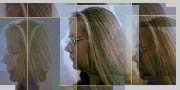
strongly, attention is captured by the new illustration and never released to the rest of the page. It's hard for the casual viewer to pay any attention to the site's branding and rest of the page content.(In a grayscale version of the snips graphic, below, you can see each element's
Where qualities more easily. When you view in grayscale, there's no color to excite the What vision system, so it's easier to see Where features.)
My site's original design was done with the Where/What vision systems in mind.
The original page focus is the branding area in the top left of the page, consisting of a logotype and an illustration of a horse (designers are workhorses, you know!). The logotype and branding illustration have large shapes, sharp edges, angles and high contrast. These features made it the most Where area of the page, so it would get attention first. The color of the logotype and its background, and the texture, detail, curves and color of the horse illustration, were What features that were deliberately introduced into this area of the design to make it less Where. I wanted viewers to see the logotype first, and stick around long enough to read it, too. The Where vision system fatigues very quickly. To hold attention on a Where element, you must add What features to counterbalance the element's Where qualities. By creating graphic with a combination of strong Where/What features, I ensured that the branding area would become the page's main focus.All this planning was undone by the intended well-balanced strengths of the
new illustration, which communicates strongly and directly with both the Where and What vision systems.The solution:
So what's the solution? The source of the problem is the strength of both Where
and What features in the new illustration, vis-à-vis the original branding graphic.I don't want to change the illustration. My only option is need to turn my
attention to the branding area, specifically the logotype and its background. Also, I don't want to spend a lot of time fixing this problem. That means I decide there'll be no changes to shapes, sizes or positions of the original logotype graphic slices.I turned back to my Where/What knowledge to assist in developing my solution.
I figured I could rebalance the page by adding stronger Where features to the logotype, to enhance its basic attention-getting qualities. But I knew that if I did this, I'd run a strong risk of making it so strong that people would see it and run the other way. So, as well as giving the logotype more Where attention-getting qualities, I'd probably need to enhance its What attention-holding qualities, to give it a good balance so people would stay long enough to read the logo, just as in the original.Remember this key to good design: Too many Where elements grab attention,
then lose it. Too many What elements may never have the chance to grab attention long enough to hold it. You need both!Below are snips and a screenshot that show how the solution worked out.

The logotype was made higher-contrast, and a block of warm transparent color
in back of the logotype was removed. High contrast and less color create stronger Where, attention-getting, qualities.The increase in Where had to be balanced by reducing the logotype font size,
and adding a fine, colored texture in back of the logotype. Texture and more color create stronger What, attention-holding qualities.The logotype and its illustration were now rebalanced. But, when the now-stronger
branding area was seen against an already strong navigation block, it was clear that together they were too Where. The navigation block had its font size reduced, and the font color lightened to reduce contrast. This improved the What qualities of the navigation block, and created a better Where/What balance for the branding and navigation area together.
Overall, these small changes completely rebalanced the entire page, and worked
well on other pages on the site that had not been otherwise changed. In addition, when a warm color block was replaced with a textured green, and the size of the logotype font was reduced and its color darkened, the site stepped into a kind of spring dress, with cooler colors and more delicate elements. It took about 90 minutes to do the analysis, make the changes, and publish the results.When you first starting thinking about how the Where and What vision systems
experience your designs and how you can best communicate with them, you'll have to do a bit of depth-thought and explicit analysis. Over time, you'll integrate your awareness of these issues into your general design skills, and incorporate Where/What knowledge into your active work intuitively. Whether you're just starting to think about these two vision systems, and how humans process what they see, or you're farther along in understanding how these vision systems work, grappling with these issues will help you design with more effective results.