
Main Page Content
Site Review French Presidential Campaign Sites Voynet2007 Fr

 Dominique Voynet, a former minister of Environment and Equipment, is standing for the leftist Green party's in the French presidential election coming up at the end of April. Her campaign site, voynet2007.fr, seems to break an exceptionally high number of basic and seemingly well-accepted usability and content design guidelines.
The first impression is not unpleasant. The body background is white and the text is rather legible, no fault here. The main tone is green, with purple highlights. I suppose the fonts and color scheme are a question of taste, to be evaluated in the context of the campaign, where all of a sudden, 15 people start to market themselves as political brands and attempt to impact the general public with their message, over the course of just a few weeks.
However, past this first glance, problems begin to pile up.
Empty
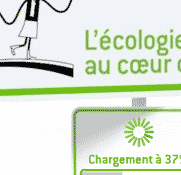
 First, this home page is empty. Besides the mandatory branding (the Green party's emblem, the campaign's mascot, and the name of the candidate), there are only two content elements:
- a news ticker at the top of the screen (could be nice but feels a little cranky)
- the campaign's slogan: "L'écologie au coeur de nos vies" ("the environment at the heart of our lives", although the French word used for environment here is more loaded with political meaning than in English)
The rest of this first screen is mainly blank, with a number of interface devices. A "skip intro" text, a loading indicator, and a link to a non-Flash version for visually impaired users. Here's how it breaks down in pixel surface:
| surface | % above | % whole | |
|---|---|---|---|
| above fold (710x580px) | 411,800 | -- | -- |
| whole page (710x750px) | 532,500 | -- | -- |
| branding | 36,743 | 8.9% | 6.9% |
| -- green party emblem | 4,085 | 1.0% | 0.8% |
| -- candidate name | 10,152 | 2.5% | 1.9% |
| -- campaign mascot | 22,506 | 5.5% | 4.2% |
| content | 24,147 | 5.9% | 4.5% |
| -- news ticker | 13,293 | 3.2% | 2.5% |
| -- campaign slogan | 10,854 | 2.6% | 2.0% |
| interface elements | 25,588 | 6.2% | 4.8% |
| -- loading indicator | 10,374 | 2.5% | 1.9% |
| -- skip intro text | 5,586 | 1.4% | 1.0% |
| -- text-only version link | 9,628 | 2.3% | 1.8% |
| blank space | -- | 79.0% | 83.8% |
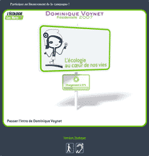
Obviously, the "content" area is simply too small to convey anything at all. However, if you do wait for the intro to load (at 575 pixels from the top of the document, the "skip intro" button is probably below the fold on many screens), the candidate walks in to that white space and changes the equation.
Intro movie
 But who will download 8MB of intro movie? Eight megabytes, yes. I haven't checked whether it streams, but it certainly didn't feel that way when I checked yesterday.
Now the face of the site is rather pleasing with this video: the candidate walks in to the frame while maintaining its clean white background, it is pretty well done. However, this remains an intro movie: she makes a very very brief pitch for her campaign, and goes on to invite the user to explore the site. I won't bother counting the seconds of content versus seconds of useless babble, but the ratio is extremely poor.
Nielsen eloquently advises against splash screens (in 2000, mind you!), but this is an 8MB splash screen featuring very little actual content, how bad can it get?
Voynet's speech ends on a cue for the site's mascot, dubbed Marianne (also the nickname of the French Republic), to start showing you around the site.
A mascot
 There again, the visual is appealing enough, although tastes may differ. Marianne is a funny little character, and she brings some freshness to the interface.
However, she's used only on the splash page and on the following home page. I don't have access to the "real life" campaign material, but would expect her to be present there -- she's just nowhere to be seen on the site.
So this intro movie takes time to introduce Marianne. It might be worth it, as you definitely don't want the candidate to be trivialized and turned into an interface element or a tour guide. However, this does mean there are two characters on the site: the candidate and the mascot. Users (voters) are unlikely to take their time to explore the non-core elements of a campaign, most already skip the core elements!
In this context of scarcity of attention, I feel the site is wasting time and minimizing the impact of the candidate. Not using the mascot any further on the site is probably a wise choice, but it makes her introduction even more wasteful.
Main navigation
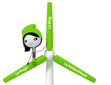 After introducing Marianne, the video pans to, well, no, not Marianne as you'd expect from the cue, but to the stylized windmill behind her. Once they stop spinning, the three blades of the mill stand for the three main parts of the site, and Marianne lets you know what you can expect from each.
Once again, this screen is very empty, and requires interacting with the interface (with mouseovers) to get more information. Not much of it anyway: the texts are of the type "in this section you will find..." and do not convey anything at all about the candidate's program or the campaign. All the actual information is at least one further click away.
The three parts are:
- "le blog", where you can "follow the campaign's events in real time"
- "the project" or the candidate's campaign manifesto
- "la médiathèque" (the media library), which proudly advertises that it's still "under construction" and suggests it offers an updated version of the manifesto
Now I should mention that most links (from the candidate's non-campaign web site, from local section sites, etc.) probably point directly to the blog (at blog.voynet2007.fr) rather than at the root of the site. This might explain why so little thought has gone in creating a main navigation that makes any kind of sense. But it's hardly an excuse.
It seems to me that the manifesto is a crucial part of an election campaign. On the web, it ought to be authoritative (identical to the paper version, complete and supported by the candidate's full commitment) and presented in a flexible enough way so that other material can be related to it -- it's the basis of the campaign! This main navigation suggests the authoritative part is offered in a section on its own, and the interactive part in another, so the manifesto itself feels more like a dead-end.
The manifesto
As an undecided voter, I wanted to learn about the core proposals of each candidate. The Green party candidate has gotten little media coverage, so I'm not familiar with the structure of her proposals this year (beyond the Greens' core positions), this was a complete discovery. I expected the manifesto to be an introduction the party's original stance (particularly "political ecology" and the advocacy against economic growth). On paper, such documents are usually a brochure of a dozen pages with a general introduction, and then the candidate's choice of issues and solutions, explained in some level of detail.
On the web, the manifesto can be enhanced by offering supporting material (media) and cross-references, as well as to tie in to discussion boards or agenda elements. For the smaller candidates who did not have the time or the infrastructure to come up with a one-off, comprehensive document, a few key elements specially produced for the campaign can be prominently placed among other ongoing position documents that are part of the party's platform. This is very relevant for parties like les Verts that are not aiming for a majority and will be scrutinized more closely on specialty issues than on the completeness of their plan.
It seems the Green party has nonetheless chosen to present its manifesto as a one-off "document", a monolithic whole that cannot evolve. Offered as a set of interactive animations, the manifesto feel more like a 1990s Shockwave demo CD than a web site. It features all the ridiculous characteristics of this minor (and thankfully defunct) art form, beginning with a navigation metaphor.
Green city?
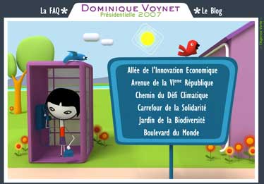 The first screen shows a list of "streets" that stand for the main parts of the manifesto. Apart from the annoying gimmicky side, we're back to that problem of usefulness: this screen shows extremely little actual information. The choice and order of topics is significant, of course, but that's all you can obtain from this page.
Click on one of the "street names", and you'll be transported to an animation, where you are requested to find the interactive "objects" that stand for issues related to the topic. The intro text helpfully offers impatient users a tip: if you can't find them all by exploring the image on your own, you can ask for them to be highlighted.
"Mystery Meat navigation" is a very old pet peeve of interaction designers, and rightly so. The makers of the site were more interested in building a cool-looking, "entertaining", interactive thingy than in the candidate's program, and actually buried the contents within the interface. This is a major sin in the gospel of usable web site building!!
I also wonder about the possibility for the candidate to introduce a new slant to her campaign, to add more detail to a topic that catches with the public or the media, or simply to fix errors. Well, everything is possible, if you can afford to hire again your Flash designers. Oh, I suppose the "under construction" part above would be the place to do this with reasonable ease. Yes, this manifesto is a dead end, and an inconvenient one, at that.
 L'Agence Verte, the communication outfit that produced this part of the site, has done a terrible job here. Then again, I suppose that's to be expected from a company whose web site features shameless (and meaningless) "marketalk", complete with spelling mistakes (well, missing diacritics and creative syntax).
Better things
The rest of the site is much better. The blog is a bit messy but not too inconveniently so, and some might regret its weak branding that nonetheless manages to use huge screen real estate. Still, the content is worth it.
It's also mercifully free of the frame that prevents users from e-mailing the URL of specific pages of the manifesto to their friends, and doesn't need the so-called "accessible" version, because it's accessible in the first place. Its use of links is web native, and it offers the usual RSS feeds and other online campaigning options (donation, newsletter, agenda, etc.).
Overall, the voynet2007.fr site should simply be the blog, and the whole introduction/manifesto quagmire should be deleted and forgotten. I hope the candidate didn't have to pay too much for this mess!